Architectural Design Presentation Techniques

On one hand you can use drawing to generate ideas and concepts for your design work….
I mean probably by now you understand that just software alone isn’t enough to get good quality work.
In the long run just using design software is a dead end and it will get you stuck in the same vicious circle of ideas… and in the long run this will damage the way you conceive architecture.
The other option is to use your drawing abilities for design presentations…
This way you focus your drawing abilities on graphics and getting really detailed final drawings.
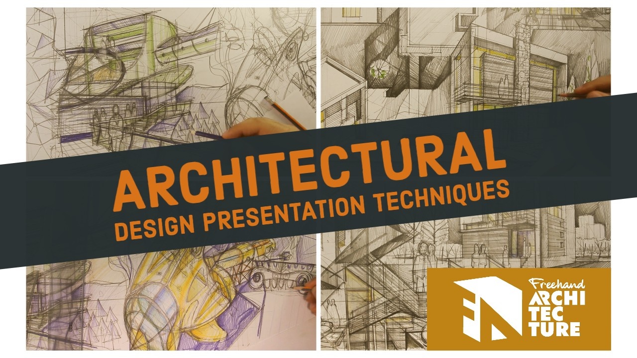
It’s not enough to just draw whatever way you would like… the end product needs to have that polish to it… so you need to apply certain design presentation techniques…
In this short article I will share with you the most important five presentation techniques which I apply myself and I teach to my students.
Disclaimer: Although you will be able to get great results just by applying these presentation techniques… you will need to have high quality design work to begin with.
You can’t get around that… it doesn’t work to have a bad design with good graphics… it will lack impact and raise a lot of eyebrows…
Believe me I’ve tried this in my years of freelancing… bad designs with good graphics are going to p*ss a lot of people off because they seem like you’re trying to use graphics to distract from a bad design idea.
The winning combination is a good design with fantastic graphics… that will definitely get you where you want to be.
1.) Use Excellent Hatching
The main difference from a schisse ideas (which is done fast) and design presentations is the hatching.
You can tell when somebody took the extra time to get excellent hatching going…
You can’t fake it and it doesn’t matter how good of a graphic artist you have, you need that extra 1-2 hours of drawing time for each A2 sheet of paper so you s
Focus on getting all the shadow accents right, on getting materials to look proper etc.
2.) Arrange Everything In A Composition
A design presentation needs to look like it’s been thoroughly thought out and planned
The way you can get this is by using several sketches to get the exact proportions right of each element before the final draft.
You can even do a progression of several thumbnails until you land the composition idea which will work perfectly for your design.
3.) Communicate Your Ideas Clearly
Contrast is good for getting all your pieces (facades, visuals, technical drawings) to pop out and thus be read really clearly.
Contrast is essential for design sheets because it gives clarity, clarity in turn says that you are dependable, clear and in your ideas and concepts.
And that alone will place you above the competition (most architectural graphics out there are boring, stale and unoriginal)
4.) Exaggerate The Spatial Depth Of Your Design Sheet
Making your design presentation sheet look like a collage of different images will give it an extra tridimensional feel… this in turn adds a lot of credibility and dimension to the overall concept of your design.
In some cases (not that rare) if you design sheet is pinned up alongside other sheets it will stand out so much that it literally makes other work look like a background for the main piece.
5.) Get The Design Layout To Express Your Main Concept
This is the hard one.
Mostly because it doesn’t depend on drawing as much… it also implies a strong link with the concept of your design.
Do you need to express your design contrasting the site context? Go for a black and white presentation with your design being colored.
Do you need your design to imply a strong connection to nature? Draw more large-scale trees and shrubs in the foreground of your main renders.
Do you need just spatial depth? Apply everything you’ve learned in drawing to get a strong foreground –midground –background transition.
Cool, so now that you know these architectural design presentation techniques, what could you use them for?
Obviously you can start by outsourcing parts of your workflow to freehand drawing…
But I also recommend you apply these very same principles to any type of design presentations out there:
Product design sheet
Interior design
Urban Design
Landscape Design
These design presentation techniques work each and every time apply them in your own work and you will get work of a very high caliber…


